Tuesday, June 4, 2013

Test Day Results: The Practicum

...

...

...

...

PASS!!

Hooray hooray!  I passed the Practicum!  I'm not really sure what else to say in this post, since I provided my "Day-of" run-down here so I'm sharing a picture! 


As you can imagine, I'm happy, confident, and feeling like a shiny new, official designer!  I won't be adding anything to the end of my name until I have my certificate number despite my excitement.  Heck, I'll probably have another celebratory post when I receive THAT. 

[A question]

How did everyone else do?  

I was willing to publicly proclaim my results even if I failed, but I understand if others aren't so eager to share.  I understand how it feels to receive those results.  And I want you to know something: You will pass. You will be happy about this. In fact, you will be happier the second time that you would have been the first time, because this isn't just a test, it's a true accomplishment.  It is a mountain to climb. And you're capable and smart even if you feel the opposite right now.  Stand back up with grace.  I promise it pays off. 

[An Announcement]

Because I've gained quite a lot of followers and page views, something I think will only continue as test-takers refer this blog or google helpful test prep blogs, I would like to keep The NCIDQ Diaries open and active.  I don't anticipate posting nearly as much as I would while I'm practicing (it would also become quite redundant), but I will check in, offer encouragement, and help with questions about the test and my experience. After all, I still receive notifications whenever someone posts a comment or question and I love to respond.  Don't ever think you're a bother and ask anything you please!  Chances are - even if I haven't shared it here - I have likely emailed NCIDQ and asked.  Also, you'll be helping me to stay sharp, too!

Best wishes to all current and future NCIDQ certificate holders!  You're truly set apart! 

Happily,
Carolyn


Friday, May 31, 2013

Ahhhhhh!!!!!

Almost here... !!!


I don't even know WHAT to feel right now. I mean, I obviously have expected this for the past several months (since I registered!), but holy butterflies!

Pass or Fail, I promise to share.  Oh, and Pass or Fail, I will be back to share updates and tips and help any future test-preppers.  

This is the official shout-out: "Keep interacting and following - I'll be here for you!"

Good luck!
Carolyn

Wednesday, May 15, 2013

Test Day: A summary!


Hi everyone!

I intended to post this right after the exam, but wow – time has flown! It feels like I took it last week. And soon, we’ll be receiving our results! That said, ... 


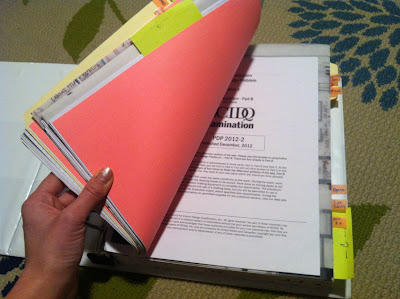
Hoping not to jinx myself too much, I thought I’d share my (eeee – good!) “Day Of” experience with everyone since the “Days Prior” posts were so ample and anxiety-ridden along the way!  Let’s start with the night before.  I had a quiet night, only flipping through my plump prep binder for about 45 minutes. My husband made me dinner and I went to bed early. I had packed everything the previous night so I wasn't stressed about that part in the morning.  I stashed my snacks and water in the fridge and I made sure my outfit was ready, too!  I wanted to wake up the next morning with as few tasks as possible.  And in the nerdiest/coolest twist: I wore my Steelers sweatshirt.  

I woke up to sunshine and nearly ZERO worries. I actually got teary on my drive because I felt so confident, calm, and yet still excited, three emotions which were foreign to me during this entire (and past) experience. I arrived early, walked the wrong way, walked the right way. 

The building in which the test was held was fairly new and so open, bright, and the temperature was perfect. I was assigned what I call "The best seat in the room!" because I was right next to a column along the wall. The column was an exposed I-Beam painted red and had a perfect little "shelf" for my water bottle (which isn't allowed on our table due to potential spilling). I found I needed to drink throughout the test, so this was a life-saver. (Even though they say you're not allowed, most proctors will allow it under your desk). 

I felt super calm and confident during the test, though I made an almost irreversible mistake in Lighting (But luckily caught it and fixed it). I took Lighting first, then Space Planning. Due to my snafu, this was a REALLY good choice because I didn't panic.  Staying focused was much easier with my seat being against the wall rather than in the center of the room, but sadly this cannot be helped. 

Unfortunately, but legally / fairly / confidentially, I will not be sharing any specific details and I won't be sharing which exercises were commercial/residential. This is not only something I signed off on - it's completely unfair to those purchasing the practice tests. 

Anyhoo! I had lunch with some great ladies in the lobby (sitting on some fab Maharam-upholstered lounge furniture) and some had even been following this blog!  (Thanks, gals! I hope you all do well!) The second half of the exam went very well.  I even finished early! And that included ample checking on all sections. 

I left feeling really happy, confident, and relieved.  A few days later, I started to think "Where could I have gone wrong?" And nit-picky, nagging thoughts set in. However, I had to accept that no matter how I did, I couldn't change it. And that thought squished any doubts quickly. 

I arrived home to these wonderful surprises from  my supportive hubby:


Ironically, I ended the day in a beautiful mood, accepting and happy regardless of what's to come and my exact words at bedtime were "Best day ever!" (a common phrase of mine... I suppose I have a lot of those.)

I've been feeling relieved, but anxious of course for my results.  They could come any day now, but as with last time... I will have Andrew open them for me! 

xo,
Carolyn

Friday, April 5, 2013

Don't Study Tonight, Just Re-Read This...

Go back and read this post.

And make your own version. 


Best wishes to everyone tomorrow. I know you'll pass if you channel your effort, keep it simple, and follow the directions. And a special thank you to everyone who interacted and were able to benefit from my TMI-Prep Fest. Setting out to help myself, I'm so happy I was able to succeed in doing so while inspiring and sharing with others along the way. 

Good Luck and Kind Thoughts,
Carolyn

Thursday, April 4, 2013

ADA Washroom Checklist

Don't forget ANY of these!
{ checklist }
  • Divide Stalls/Urinals (60" x 60" min for ADA, door swing out; 60" x length of wall, door swing in; 36" x 48" standard, door swing out)
  • Doors are 30-32" in standard, 36" in ADA stalls
  • Draw in wall-hung toilets & Urinals
  • Draw in grab bars to scale and dimension length from wall and length of bar (36" behind toilet mounted 6" from nearest wall, 42-48" beside mounted 12" from nearest wall)
  • Dimension stalls (width and depth!!) 
  • Dimension center lines of toilets to stalls/walls; 18" from each side
  • Dimension center lines of urinals to privacy screen/walls; 18" from each side
  • Draw in Lavatory(ies)
  • Indicate which one has ADA open space below; the width of open space
  • Draw in mirrors, soap dispensers (1) per sink, hand dryer, trash receptacle 
  • Draw turning circles 60" in common area, at door, and in ADA stall (not overlapping door swing!)
  • Draw 30 X 48 clear floor space to scale (dotted rectangle) at sink and ADA urinal (NOT at toilet) and LABEL it as such.
  • Tag all fixtures (!!!)
If you practice this (perfectly) often, you'll be able to do it in 10 minutes! I am not kidding! 

And that means... more time to spend on the less-predictable Millwork exercise!

Almost there,
Carlyn

Wednesday, April 3, 2013

Did you print your Admission Letter?

... no? Please go do this!
...

...

NOW!

Love, 
Carolyn

The Post Where I YELL!!

Ok, so this is a humorous, but firm reminder to meet the program requirements and not focus on the prettiest plan you ever did see. The graders are NOT judging your handwriting, your wispy window treatments, or your plump throw pillows on the bed. And the sofa. And the club chairs. 

I noticed a few of the sample solutions in which the candidates were able to draw 8 throw pillows on a bed and 6 on a sofa, but they didn't draw electrical outlets in the Bedroom. And they didn't draw a 30 X 48 clear floor space at the sink in the kitchen. 

Really, the pretty and "omg so clever!" solutions don't PASS. The thorough ones do. 

So, don't worry about including the cute chandelier. And don't fuss over dimmers (if you're uncertain about a dimmer, safely specify standard down lights (75W) and add a "D" to your switch). And don't squiggle curtains at your dining room windows. 

I saw the prettiest architectural lettering and straightest lines in a Millwork solution. AS THE FAIL EXAMPLE. 

We're not taking this test to pick cute pillows. We're not decorators. This is not a decorator license. This is your DESIGN LICENSE. This is what sets you apart in the design world. This is what shows that you're more than a fandeck of paint chips and a pillow karate-chopper (please don't do this). This is your expensive, hard-earned license proving your ability to design a space which ensures the health, welfare, and safety of its occupants.

So no over thinking. No unnecessary cute-sy stuff. Slow down. Check your work. And read your scale properly. 

Best of luck,
Carolyn


Tuesday, April 2, 2013

Your Tips!

I've truly enjoyed sharing what works for me and now I'm wondering what has worked for you! It seems we've all been learning as a group, near and far. While things may seem obvious to us, they may not only be brand new to others, but truly life-saving come test day. 


Bloggy Views!

So please, if you have any tips, please post in the comments and I will compile them for a post tomorrow evening (Wednesday). (I know that font below is hard to read... sorry!)

Base on last night's posts, I'm still finding room for improvement!

Also, this is a great post by Q-Practice: 
Common Exam Mistakes

Thanks!
Carolyn

Monday, April 1, 2013

Space Planning: 64 SF ADA Restroom

Me: Can the turning radius in an ADA restroom - with a closed door, not a stall - overlap the door swing or not?
Dad: It depends on the state and jurisdiction. 
Me: What about PA?
Dad: <insert confusing, but sensible answer(s)>
Me: So, I'm just going to be safe and assume it should not overlap. 
Dad: Yeah, that's a good idea. 

I had to... hehe. 

Reason for asking: the 2010 test did not mark candidates off, but the 2012 test did. 

After a little tweaking, I figured this is a safe layout for an 8x8 Accessible restroom. That's 64 SF, FYI, and required on the Space Planning exercise. It has to do with door placement. It also has to do with a wee bit of common sense. I placed the door in such a way that a person in a wheelchair could not sit on the pull side and actually open the door without trouble. And here's what I came up with... (Click image for larger)

{ Compliant }


{ Non-Compliant }

Incorrect overlay in red...

See how there is no room for the 30 x 48 accessible floor at the sink? And not much room at all to pull the door open if one's in a wheelchair? Even though I drew my toilet a wee-larger (oops), doesn't it seem like there's less room to pull up beside the toilet? 

Keep it spacious,
Carolyn

TIP: Swap Base Plans

This time around, I purchased TWO PDP's instead of one and I highly recommend it. Heck, I probably would have loved THREE. The nice thing about 2 or more tests is the ability to do the following (TIP Alert!):

Swap exercises and double your practice!

That is, if your entire space square footage is close. If it's off by quite a bit - make your own "extension" or take away some area. 


I have a commercial space and a residential space. For instance, if the SF is close enough (within 200 SF), trace your commercial base plan and use your residential program requirements. (I'm adding a few windows since the commercial space only has windows at the entrance.

Go for it!
Carolyn


Space Planning: Combination Tip

If you're like me, no matter how much you practice Space Planning, you still have a frozen moment or two in the fast paced 3 hour exercise. In an effort to replace bad habits with good, I've been trying new tricks and strategies. 

I find that maintaining balance while trying to accomplish the following is tough...

  • a list of spaces
  • square footages for spaces in list
  • adjacency requirements for spaces in list
  • specific location requirements for spaces in list (i.e. fireplace as a feature in the living room will mean that's the only place for that room, foyer/entry should be AT the main entrance)
  • plumbing trench 
  • plumbing trench extension limits
  • fitting FFE requirements in said spaces
  • fitting clearances around and in said spaces
  • dimensions
  • electric
  • notes
{ Challenge }

Meeting square footage requirements with a layout that makes the best use of the space is where I get stuck. AKA, the transition from somewhat-to-scale-but-not-really bubble diagram. I'm guilty of not feeling comfortable until my plan is hard-lined, so I rush this step. I'm then left with a bedroom without a walk-in closet and no choice but to take SF from the bedroom itself. 

TIP: Combine spaces where possible. The walk-in closet is obviously going to be in the bedroom, right? Chances are, the master bath too, right? 

Try adding the bedroom SF + master bath SF + walk-in closet SF together. You might have (1) large rectangle like this:


Let's say your Walk-in Closet is to be 40SF, your Master Bath 120, and your Master Bedroom 240. Add them up:


40 SF + 120 SF + 240 SF = 400 SF

Next, if it helps, draw a rectangle on trace which equals 400 SF. See how the one above is 17'-0" wide? Divide 400 by 17 to get your approx length = 23'-6". Move this around on your plan (as you would in AutoCAD) to find it's best place. TIP: The toilet/shower will need to be on the plumbing trench or an extension. 

TIP: Don't forget to share plumbing walls where possible! Back to back or side by side. 

Other spaces this will help with:

  • Kitchen+Break Room
  • Workroom+Storage
  • Kitchen+Pantry
  • Kitchen+Laundry
  • Kitchen+Pantry+Laundry (whoa!)
  • Accessible Bedroom+Closet+Bathroom
  • Public space vs. Private space

Hope this quick tip helps! I plan to practice it tonight with both a commercial exercise and residential. Though from research and experience, I'm confident the space planning with be residential (usually is for Spring). 

Happy prepping!
Carolyn


Saturday, March 30, 2013

Transition time...

... Less prep, more nature. It's officially the ONE WEEK mark! 


{ Part 1: Butterflies and Swimming }

I've found a calming way to nearly eliminate my test anxiety and after practicing it for about 3 weeks, I can confidently say it has healed me! Remember what I said in this post about test anxiety being a habit? Well, to break a bad habit, we must replace it with a good one. Can't quite shake it completely? Begin by following a negative feeling with a positive thought. 

I've been getting random bouts of butterflies in my stomach (nerves, anxiety, surges of bad energy). I thought back to my days as a competitive swimmer. I got butterflies before every race and they were GOOD butterflies. And another thing? Whether I won or not, I would kick some serious booty and usually improve my time. Silly worry. 

Every time I get butterflies, I think of my swim meets. And the memory makes me smile. I find these butterflies to be a surge of strength and happiness now instead of doubt and fear. 

{ Part 2: Swimming and Test Prep }

Because my connection to swimming helped so much with my test anxiety, I've adapted my test prep plan to mimic my pre-championship meet training schedule (which always yielded best times and great swims!). 

Before a big meet, we'd train hard for months (with the hairiest man legs you've ever seen) and taper down two weeks before the meet. I'm entering my "taper week" and doing a lot more relaxing, exercising, and spending time with family/friends/nature. 

Just keep swimming, swimming, swimming,
Carolyn

Sim Day Results: ADA Washroom

ADA Washroom is another easy-breezy section for me. Along with Systems Integration, I find it's less intense than Space Planning, Egress, and Life Safety. It's 30 minutes and it's pretty straightforward. It's always a men's restroom (as we must know urinal clearances) and it almost always has the exact same requirements. Below is a breakdown, not my actual results. Results follow and they're boring because I only missed one dimension.


{ The Deets }

  • (1) Accessible min 60 x 60 toilet stall with 36W grab bar behind the toilet, a 42W grab bar beside the toilet, a 60" turning radius, side access, a 36W door, and dimensions/tags of all; door swings out.
  • (1-2) Standard toilet stalls 36W by 48D with a 30W min door or a 32W door, dims to center-line of toilet and indication of the width and depth; door swings out.
  • (1-2) Standard urinals tagged and dimensioned; TIP: min space between two urinals center-line to center-line is 32".
  • (1) Accessible urinal tagged/dimensioned and a 30 x 48 clear wheelchair space.
  • A degree of privacy from door sight line, screens between each urinal
  • Tag all fixtures
  • Fill in fixture schedule provided like this one
  • Fill in finish schedule for substrate and finish:
    • Cement backer board
    • Ceramic tile (if you want to get fancy, glazed ceramic tile or glazed ceramic subway tile are also acceptable)
TIP: My dad's an architect - so I'm often calling him with questions. I was chatting with him about the ADA Washroom exercise and he said (which may be obvious to others and it's how I've been doing it, but still a good reminder!) to start with the ADA toilet stall in the corner and work your way over with the remaining space. 

[ start at wall furthest from door -> 60 x 60 -> 1.5 panel -> 36 x 48 -> 1.5 panel -> 36 x 48 -> 1.5 panel -> 16-18" to cL of urinal -> 1.5 privacy screen -> 16-18" to cL of next urinal -> 1.5 privacy screen -> 16-18" to cL of ADA urinal -> 1.5 privacy screen ]*

*this is just an example. Your actual test requirements for quantities of stalls/urinals may vary. 

I did very well on the 2010 PDP which I used for my Sim Day. However, the test is formatted differently now. All clearances were shown, tags added, and dimensions to fixtures. I saw one example where a candidate didn't tag any of her fixtures, but labeled a few. It was still a passing solution.

Good luck,
Carolyn

Friday, March 29, 2013

Sim Day Results: Millwork

I did not like this exercise!  But despite my personal aversion, I passed. I guess I need to explain why on that first statement... not that it will help you or me pass. This exercise was more of a test in furniture design, rather than millwork. It's not unlike millwork, but this seems to be another part of the test to have evolved since 2010. 

Need inspiration? This is a great piece of student work by a student in Florida (link here), which shows a wide range of detail and ADA compliance. It is NOT an NCIDQ test. Click image for larger view.

Something I didn't know: You can draw more than one elevation if it helps convey your design intent/ADA compliance. However, I've never needed to do this on the newer exams.
{ Room for Improvement }
  • I don't know if this is incorrect, but I indicated the 30X48 clearance at the accessible portion of the counter as "side approach". The toe kick and counter height were compliant, but I saw the other solutions literally left room under the surface for knee/foot room - a.k.a. totally open. 
  • I missed a few "depth" dimensions in my section (counter and transaction counter). 
  • Again, not sure if this is wrong, but I only provided one elevation and it was of the front of the piece (approach/welcome side). It conveyed accessibility, relationship between height of transaction counter and ADA height surface, toe-kick height, counter thickness, materials, and front design (which seemed to be emphasized in the program). I showed the section of this, which as a section should, went into more detail on ADA vs. standard components and construct-ability.
I think this 2010 PDP continues to confuse me more than help me... Sadly. 

Keep Going,
Carolyn

Sim Day Results: Systems Integration

Today's Sim Day Results comes in the form of a few tips/reminders, rather than a list of rights and wrongs. This pretty much sums up my common mistake with this exercise. I only got one wrong, so I'm thinking I passed ;) 

TIP: Don't forget the P of MEP! Most of the problems in this exercise will have to do with the ceiling, but in a rare (and possibly phased-out) instance, we must look down. Conflicts with plumbing trenches and structural portions of the floor may arise. In addition to looking down, reference the building section provided. 

TIP: As I shared in this post, it's very important to use the building section provided. You might not need to solve every problem, but there will definitely be one or two which will prove difficult without it. See below. 


{ What the section clarifies }

Structural beams, joists, and columns (Sizes and locations)
What this means: you cannot run a duct, sprinkler line, or plumbing trench through these solid (usually concrete or steel) building components.

Ceiling height changes 
What this means: If a ceiling pops up, you cannot run duct work at the same height or it would continue through the wall and *exposed* across the pop-up. Same goes for sprinkler lines. If a beam is running across your ceiling plan, the section might also show this - it would be the opposite of a pop-up and because it's structural, you still cannot run components through it (see above).

Happy Prepping,
Carolyn

Wednesday, March 27, 2013

Dimlabelgram!!

It's not a spelling error, friends. It's a word I invented that makes both me and my husband laugh. And sticks in my brain. And it holds a strategy which I think will help anyone avoid mark-downs for "small" errors. Let's say it together now: Dimlabelgram.


... { Meaning }...

Dimlabelgram: (v) [dim-LAY-bull-gram] the act of checking one's Practicum exercises for proper dimensions & clearances, labeled  FFE & mounting heights, and compliance with the provided program.

Example:
Halt! 10 minutes to go! Time to dimlabelgram my solution! Oops... didn't label my mirror. Oops again, forgot a 5'-0" turning circle. 

I found that pretending I'm a grader for the last 10-15 minutes of each exercise forces me to scrutinize the details. This isn't a good time to catch something big and irreversible. This is why it's important to evaluate your plan of attack early on - see one of my strategies "The Three Phases" of Space Planning in this post. To avoid 3 to 4 little mistakes is valuable to me. I have even considered writing it on my test booklet in big red letters. But then again, you hand those booklets back in. And I wouldn't want the graders thinking I've got a few screws loose. Which I suppose is true. Per this post. But whatever it takes to pass... have some fun along the way. 


Should I "Add this to dictionary" per Spellcheck?

Happy DLG-ing,
Carolyn

Tuesday, March 26, 2013

2 Hours of Organizing Well-Spent!

{ Disorganized }

A week ago, I walked upstairs to my studio to start my day of practice and cringed at the sight of my test materials "neatly" arranged strewn across my pink yoga mat... (glad that's serving its intended purpose! Maybe I NEED to incorporate yoga into my regime. No, really.) There were parts of the 2010 test, the 2011 test, and the 2012 test misplaced The sight alone made my stomach churn. I started to think "Is this how my knowledge is organized? Is this why I lose focus? Why I freeze? Because I'm not orderly!?"

I mean, it wasn't helping
{ Organized! }

I pulled one of my empty heavy-duty client binders out and vowed that everything would not only have a place, there would be order. And I could study anywhere I could fit a binder! And that's just what I did.


 Cover page
 A blog post (oooh look! me!)
 A practice test...
A test booklet.


...{ Table of Contents }...

  1. All about the NCIDQ
    • Important information from the website re: the Practicum
    • My test information, registration, and any other documents I found to be useful
  2. 2012 Practice Test
    • Space Planning Exercise Booklet
      • Space Planning Exercise vellum test sheet
      • Related blog posts
    • Lighting Exercise Booklet
      • Lighting Exercise vellum test sheet(s)
      • Related blog posts
    • Egress Exercise Booklet
      • Egress Exercise vellum
      • Related blog posts
    • Life Safety
      • Life Safety Exercise Booklet
      • Life Safety Exercise vellum
      • Related blog posts
    • ADA Washroom
      • ADA Washroom Exercise Booklet
      • ADA Washroom Exercise vellum
      • Related blog posts
      • Bobrick ADA Guidelines
    • Systems Integration
      • Systems Integration Exercise Booklet
      • Systems Integration Exercise vellum
      • Related blog posts
    • Millwork
      • Millwork Exercise Booklet
      • Millwork Exercise vellum
      • Millwork "Guide" Sketch
      • Related blog posts
  3. 2011 Practice Test
    • Same as above
  4. 2010 Practice Test
    • Same as above
It has shaped up to be a pretty thick binder. Thank goodness I started with a) 4" and b) heavy duty. I love it. Not only is everything in one spot, easily referenced when I need to pull an exercise, but I can take it almost anywhere! 

Stay Organized,
Carolyn


Monday, March 25, 2013

Ask and You Shall Learn!

I had some questions for NCIDQ after taking the 2010 practice test (before the test was re-vamped a little). I emailed a contact there and received some helpful answers. I was only asking for myself, but perhaps someone out there was hoping for some clarification as well. 


Q: I know the test can be taken in pen. But what about other colors?

A: As long as it's smear-proof and legible for the graders, it's ok to use color.
Reason for asking: I have a hard time seeing where I've placed Smoke Detectors, Emergency Lights, AV alarms, and FEC's on my Life Safety Plan when I do it in black. I practice with Extra Fine Point Blue Sharpies and I do much better!

Q: I know toilet and shower drains must be on plumbing trenches (*ON!!), but does this limit us to the trench provided or does it include the trenches we extend? 

A: Any trench, yours or provided, as long as the trench is clearly drawn, dimensioned, and the drains are directly on the trench. 
Reason for asking: I felt uncertain, so I assumed only the trench provided - which, as you can imagine, limited me beyond hope.

Q: On the Space Planning exercise for the 2010 PCP, one candidate was marked down for an electrical mistake in a room that didn't require electric. Why?

A: Not sure why, but they are only looking for electric/data in (3) spaces in this exercise. 
Reason for asking: If I go above and beyond, could it count against me? 

A product review...
I may get in trouble for saying this, but I really would not recommend using practice tests from 2010 and earlier. These tests are a bit dated in format and content. Will they help? Sure. However, this test confused me rather than helped me. I was disappointed having spent $130+ for this test for three reasons: 

  1. I didn't like trying to de-code conflicting information in the program requirements.
  2. Taking the time to email NCIDQ for clarification (it should be straightforward as a standardized licensing exam)
  3. The solutions online do not offer as much information as the booklet. 

Keep at it,
Carolyn

Sim Day Results: Egress

Grade: Borderline Pass

How I felt during: A little confused at first, but determined

Why confused? I couldn't figure out what the furthest travel distance was in the existing space and I was taking a ton of time trying to measure different routes. Well, it didn't matter anyway, because along with all THREE solution examples, I got it wrong. In fact, I still disagree and I'm sure many other candidates would as well. Another pre-revamp, I suppose. Also, the restrictions really left only one reasonable layout, which took me a while to figure out. 
{ How I Did }
  • I chose the incorrect "furthest common path of travel" in the existing suite. (All three examples also got this wrong and 2 passed despite)
  • Because of the above, my calculations for Travel Distance to Stair 1 and Travel Distance to Stair 2 were off, but correct for what I had. (Again, still doesn't constitute a failing solution)
  • Where I would say I tipped into Borderline Pass was this: I miscalculated my Occupancy for one of the 4 suites, which affected my occupancy load per stair.
2287 SF / 50 (Exercise Room) = 46
I *somehow off in la-la-land* got 12...

However, I noticed this same mistake on several sample tests and graders would note that despite a math error, if the candidate still demonstrated knowledge of how to actually apply the correct method of determining load per stair, they were not automatically FAILED.

Now, combine these errors... I don't know what to take away as far as correct grading, but I will learn from it!

I am happy that I have overcome the hurdles of laying out my spaces and understanding the difference between "common path of travel" and "distance to stair 1 & 2."

Now exiting, 
Carolyn

Sunday, March 24, 2013

Door Hardware: Rules of Thumb

Anyone else struggle with door hardware? In my almost-7 years of working experience (and 4 years of college), I've never really had to assign it. Architects always did, while I checked all materials, heights, and frame types. 
I spy a panic bar! 
photo: King County Library
Recognizing there are several "acceptable" answers, but usually a "best," I am usually pretty frustrated when I get 3 of 4 hardware selections wrong or "not exact." I learned that the newer tests (since 2011) have really narrowed down correct answers. On my latest test, I only got 2 of 4 wrong, but I had to ask NCIDQ directly. Before clarifying with them, I had 3 of 4 wrong. Heck, I could have only 1 of 4 wrong... 

This isn't a memorization test, it's a test of application, knowledge, and creativity. Therefore we have to LEARN it rather than just memorize a fact and forget it 4 days later. 

{ NCIDQ Partition Rules of Thumb }

  • Rated partitions
    • Demising walls between tenant suites
    • Walls between tenant suite and public space/corridor (i.e. elevator lobby)
    • Walls between assembly spaces (>750 SF) and adjacent space or tenant corridor
    • Walls of a storage room >50 SF
  • Rated partitions must extend to the underside of the deck
  • Acoustical partitions must extend to the underside of the deck
  • Rated = acoustical 
  • Office-to-office or office-to-corridor extend to finished ceiling
  • I rarely see 4" Above Finished ceiling as a correct answer. I'm still not really sure why it's an option? Anyone know what instance this would be used (on the NCIDQ)?
{ NCIDQ Door Rules of Thumb }
  • Doors in a rated wall assembly (1-hour) must be a minimum 20 min. rating
  • Most door frames can be AL unless required otherwise
  • Doors are 7'-0" high and commonly 3'-0" wide with a few exceptions
  • When "visibility" is required, I like to use either minimal glazing on the door itself, or a frame type with a sidelight. Why? Because rated doors have limits on the amount of glazing. These limits vary per code. Most fire-rated glazing is actually 45-min which is greater than the 20-minute minimum required by NCIDQ.
  • I use SCW (solid core wood) doors throughout unless I have a storage or utility room. These are typically utilitarian with louvered vents or are completely solid-faced (but hollow on the inside) HMD (hollow metal doors). 
{ NCIDQ Hardware Rules of Thumb } 
  • Rated doors require a closer
  • "Controlled access" or "Secured" typically requires a Card Reader or a Code Lock
  • Assembly space >750 SF should have a closer and a Lever Passage set typically. A panic bar is also acceptable, but not required.
{ The What and Why of Door Hardware }
What is each set and where would we use it?

To better see the chart, please click on it and it will become larger in your browser.
Good lock luck,
Carolyn

Sim Day Results: Life Safety

Grade: PASS

How I felt during: Strong, efficient, and thorough


{ How I did }


Door/Frame/Hardware Schedule 
(26/28 Selections Correct)

  • Got my door heights right this time! All 7'-0"
  • Used HM (Hollow Metal) for a storage room door, and SCW (Solid Core Wood) for all others
  • Kept it consistent: AL (Aluminum) frames for all
    • Kept it consistent: Same door type for all single doors, with the exception of one double door (no visibility requirements)
  • Rated all doors requiring it to 20 minutes (not one hour!)
  • I selected 2 of 4 locksets incorrectly. Bummer. Well, really - who knows if they could be right? The solutions are not helpful. I'd love to learn this!!
    • (X) One was for a rated storage room (TIP: greater than 100 SF must be rated) requiring controlled access. I selected a Lever Passage Set with Maglock and Card Reader. Correct: Lever Passage Set with Maglock, Closer, and Card Reader. TIP: Rated doors (like this one) require a closer. 
    • (X) For a rated assembly space, I specified: Lever Passage Set with Closer. Correct: Lockset with Panic Bar and Closer.**
      • **Still not sure why a panic bar is required in a training room. Panic bars are typically required on exits from a tenant space, doors to stairways, and exits from stairways/buildings. Anyone know for sure?
Partition Schedule 
(14/15 Selections Correct)
  • (X) I got everything right except a Conference Room wall with acoustical properties needed to extend to the deck not 4" above finished ceiling; TIP: Acoustical = to deck. 
Plan
  • (X) Missed an Exit sign
  • (X) Drew arrows on an exit sign in the wrong direction
I will be featuring a post this week titled "Hardware: Rules of Thumb." I'm determined to get this right!!!

Luck with locks,
Carolyn

Saturday, March 23, 2013

Sim Day Results: Space Planning

Take 1. Grade: Borderline Pass
Take 2. Grade: Pass


Here are some sketches on trace... TIP: Embrace color! Color-code your program requirements. Highlight key points. Draw duplex symbols in the room chart where they're required so you don't forget!

I break this exercise down into THREE phases (not unlike the Process of Design):
  1. Conceptual - After reading the program, Develop 3-4 Adjacency/Bubble Diagrams (as close to scale as you can, draw loose squares/circles for spaces) placing required spaces in different layouts that work. Then, still in the conceptual phase, develop them further - if you choose 1 of your 4 layouts, sketch what I call a "Detailed Bubble Diagram" in which you start to sketch straight walls ROUGHLY. Then, move on to #2.
  2. Soft-to-hard line drawing. Place your walls, doorways, millwork, and plumbing using pencil. This is a critical phase where you're scaling each space per required square footage. You might run into "reality checks" here, where you're rough layout from #1 might not fit as perfectly as you envisioned. During this phase, you're sketching in big furniture, etc. to make sure they fit (and fit well!!). 
  3. Dimensions & Details. This is where I transition from pencil to extra-fine-point black Sharpie. I've established my walls and I can confidently solidify my drawing. Once walls are set, I add room names and SF. During this phase, I'm drawing in all required FFE, adding my WC turn-circles, dimensions, electric, appliances, details, and notes. 
This exercise is 3 hours, but while it might make sense to spend 1 hour per phase above, it doesn't always work out that way. Sometimes I've only spent 30 minutes on Phase one, which might not have been enough because Phase 2 would take the next 1.5 hours - me fixing problems stemming from a hasty start.

{ The Most Turrrrible Layout }

You might have noticed above that I took this twice. Exactly one week apart. Why? Because I HATED my first plan. It was compliant, met the program requirements, and only had about 6 omissions & errors, but it was terribly laid out. I felt I needed more practice in space planning in an empty space. Normally, I'm partially planning the space. And I'm almost never aware of a plumbing trench (not because I don't care about it, but because laying out offices, conference rooms, and workstations rarely involves kitchens/bathrooms). 

{ Take 1 }
  • Did not label built-in bookshelves, just drew 'em. 
  • One of my doors was less than 36"W.
  • My storage room was long and narrow and not truly functioning efficiently, even though the SF was met.
  • The program stated "storage nightstands" and I just drew circles. I didn't draw drawers/knobs, nor did I label it as "storage". I might be a little strict here as I did not notice others being marked off for this. 
  • I did not include single-pole hanging in a closet. Hello? A woman's closet needs hanging space for long dresses! My own closet ONLY has single pole storage!
  • My master bathroom is super long and narrow. And while it meets the requirements, I would certainly mark me down for it.
{ Take 2 }
  • Missed a dimension designating the width of my corridor. 
  • Did not label the wall-mounted mirror in the Master Bathroom.
  • Did not label my pantry shelving. 
NCIDQ isn't looking for the perfect and ideal floor layout. They're looking for ADA compliant, accurate SF, somewhat sensible layout, adjacency attention, dimensions, details, notes, and properly scaled FFE, etc. However, while I'm not determined to provide some award-winning floor plan, I find that the layout takes the longest for me. Hence, my spending extra time practicing this. My space plan in TAKE 2 is not only compliant, it's clever, functional, and desirable. I'd want to live there! I'm happy I took the time to practice because my confidence is elevated. 

Make the most of the next 2 weeks!
Carolyn