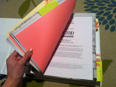
Take 1. Grade: Borderline Pass
Take 2. Grade: Pass
Here are some sketches on trace... TIP: Embrace color! Color-code your program requirements. Highlight key points. Draw duplex symbols in the room chart where they're required so you don't forget!
I break this exercise down into THREE phases (not unlike the Process of Design):
- Conceptual - After reading the program, Develop 3-4 Adjacency/Bubble Diagrams (as close to scale as you can, draw loose squares/circles for spaces) placing required spaces in different layouts that work. Then, still in the conceptual phase, develop them further - if you choose 1 of your 4 layouts, sketch what I call a "Detailed Bubble Diagram" in which you start to sketch straight walls ROUGHLY. Then, move on to #2.
- Soft-to-hard line drawing. Place your walls, doorways, millwork, and plumbing using pencil. This is a critical phase where you're scaling each space per required square footage. You might run into "reality checks" here, where you're rough layout from #1 might not fit as perfectly as you envisioned. During this phase, you're sketching in big furniture, etc. to make sure they fit (and fit well!!).
- Dimensions & Details. This is where I transition from pencil to extra-fine-point black Sharpie. I've established my walls and I can confidently solidify my drawing. Once walls are set, I add room names and SF. During this phase, I'm drawing in all required FFE, adding my WC turn-circles, dimensions, electric, appliances, details, and notes.
This exercise is 3 hours, but while it might make sense to spend 1 hour per phase above, it doesn't always work out that way. Sometimes I've only spent 30 minutes on Phase one, which might not have been enough because Phase 2 would take the next 1.5 hours - me fixing problems stemming from a hasty start.
{ The Most Turrrrible Layout }
You might have noticed above that I took this twice. Exactly one week apart. Why? Because I HATED my first plan. It was compliant, met the program requirements, and only had about 6 omissions & errors, but it was terribly laid out. I felt I needed more practice in space planning in an empty space. Normally, I'm partially planning the space. And I'm almost never aware of a plumbing trench (not because I don't care about it, but because laying out offices, conference rooms, and workstations rarely involves kitchens/bathrooms).
{ Take 1 }
- Did not label built-in bookshelves, just drew 'em.
- One of my doors was less than 36"W.
- My storage room was long and narrow and not truly functioning efficiently, even though the SF was met.
- The program stated "storage nightstands" and I just drew circles. I didn't draw drawers/knobs, nor did I label it as "storage". I might be a little strict here as I did not notice others being marked off for this.
- I did not include single-pole hanging in a closet. Hello? A woman's closet needs hanging space for long dresses! My own closet ONLY has single pole storage!
- My master bathroom is super long and narrow. And while it meets the requirements, I would certainly mark me down for it.
{ Take 2 }
- Missed a dimension designating the width of my corridor.
- Did not label the wall-mounted mirror in the Master Bathroom.
- Did not label my pantry shelving.
NCIDQ isn't looking for the perfect and ideal floor layout. They're looking for ADA compliant, accurate SF, somewhat sensible layout, adjacency attention, dimensions, details, notes, and properly scaled FFE, etc. However, while I'm not determined to provide some award-winning floor plan, I find that the layout takes the longest for me. Hence, my spending extra time practicing this. My space plan in TAKE 2 is not only compliant, it's clever, functional, and desirable. I'd want to live there! I'm happy I took the time to practice because my confidence is elevated.
Make the most of the next 2 weeks!
Carolyn


.JPG)


.JPG)
